How I Design My Book Covers
So you’ve done it. After laborious hours and a lot of cups of tea, you’ve made it to the end of your book and you’re ready to start thinking about what you want for your cover. (Or, if you’re anything like me, you’ve been thinking about what your cover will look like for years now.) But what exactly should you get, and what’s the best way to get the idea of your story across? Let me break down what I did for my covers, and what I’ve learned in the process of publishing my first series.
[Please note that this is tailored more towards Independent Authors and Self-Pub folks. The process for cover designing with traditional publishers is quite different, and there can be a lot less say from the author.]
Genre
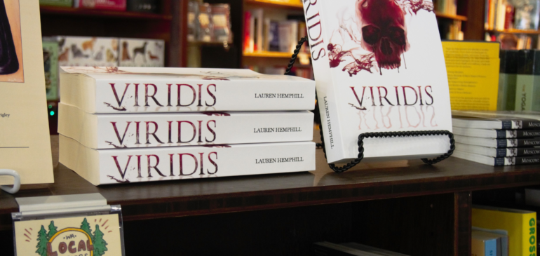
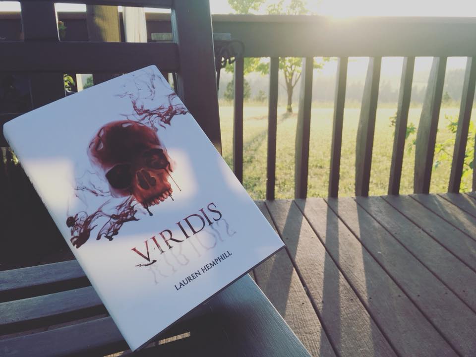
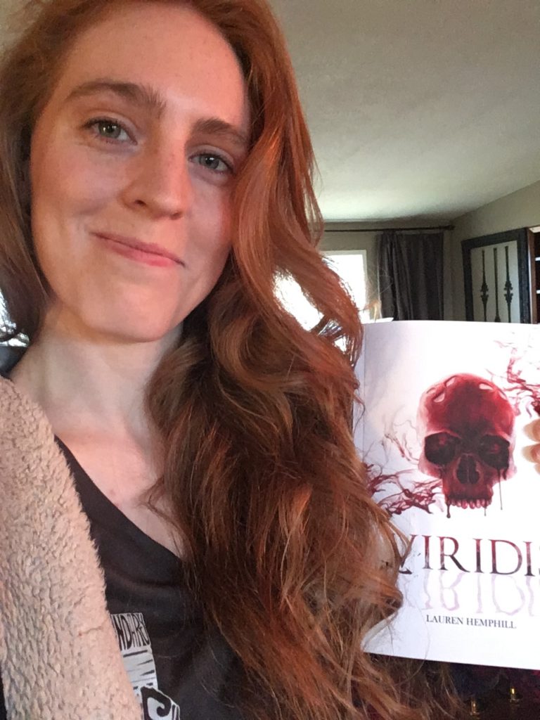
When designing a cover, you want to make it somewhat clear what your genre is. Many readers still check out books in a physical bookstore, but there are also a lot of online stores where people will browse new reading options. When designing a cover, you want to make sure you do something to signal your books genre. Let’s take a look at my first book cover, Viridis.
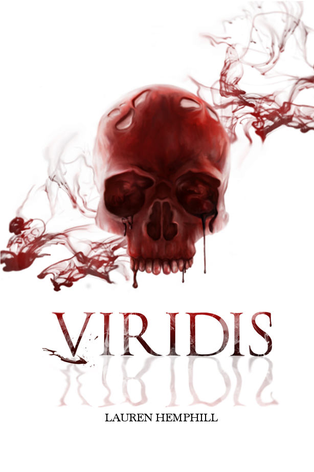
Here, you can see the red, bloody skull and the title. What’s that tell you? Well, if anything, it hints at horror, which isn’t entirely what I meant to do. I didn’t realize my mistake until later, but let’s see what the original idea was, and what I could’ve done to make it a little less “horror-esk.”
Viridis’ cover design idea was originally based off Chloe’s crimson skull painted on by Jade, the main character of the novel. The realistic look, the gruesomeness, was to indicate that this book was violent and to play into the triology’s overall theme – which we’ll get into later in this post. Now, what could I have done to make sure the sci-fi vibe came across a little better? Well, I could’ve made the human skull something else – maybe one of the alien species’ skulls, or used a prop, such as the commonly used weapons in the universe, H-Blades, to stab through the skull, hinting at progressed technology. Would the bloody skull still give off that horror vibe, even if there were a few sci-fi elements? Oh, most definitely. But it also would’ve at least better narrowed down the genre for people at a first glance. Am I upset about the cover, or dislike the cover? Not at all. I don’t think I’d change anything about it now, and I really love how it looks. But in the future, I’ll work on making sure these sci-fi elements come across a little better.
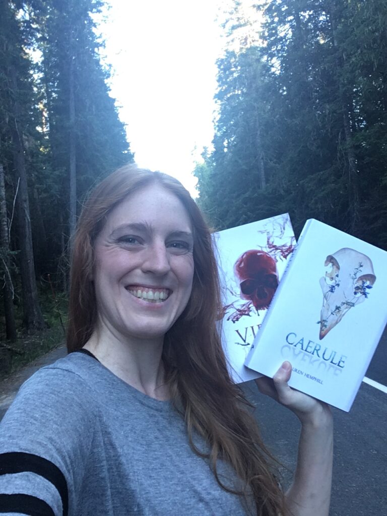
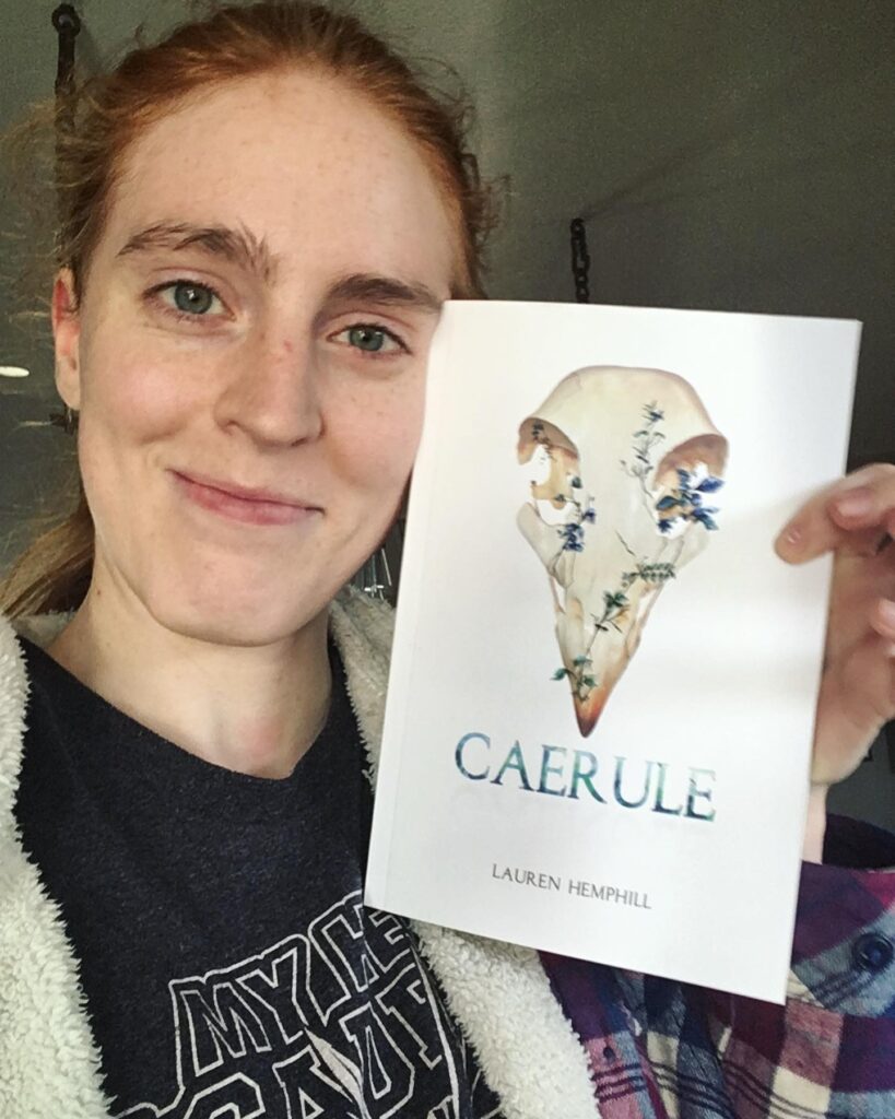
Did I succeed? Let’s look at the cover for Caerule, the second book in the Viridis series.

Here, we see a new, alien skull. In addition, we have some plants growing out of it, plants that are most definitely not native to the world we know today, indicated by their coloring. This gives a better “otherworldly” feel to the cover, I think, while keeping the overall white cover background that I like so much.
Age Group
An indication of the age group your book is for is another great thing to factor into your book cover creation. For instance, books with giant, bloody red skulls on them are generally not for children! This is a great additional way to signal that the written piece is not for those under a certain age or maturity level, and that parents should not pick it up for their kids.
Comparatively, let’s look at another book cover that is for kids: Endling.
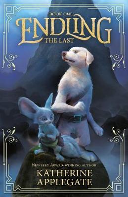
Not only is the cover beautifully done by the cover artist (give the artist some love), but it gives that soft, whimsical feel. It hints at a bit of foreboding, with the characters standing erect, peering either direction, alert. The dark background gives the sense that there is danger, but not violence. The characters are equipped for what seems to be an adventure, with no clear weapons. The soft touch, the golden lettering and bordering–that, to me, gives the feeling that this story is more whimsical, but does have some darker elements. That it’s not “adult,” but it isn’t for little children, either.
(Endling is a fairly good book – it’s a bit too young for me in its writing style, but it’s definitely something an elementary kid might enjoy!)
Obviously, the cover must be paired with the proper age range information as disclosed by you or the publisher, to further ensure there is no mistaken purchase (this is done during the publishing process and should be disclosed in marketing materials as well, to help people make an informed decision), but a cover is a great way to catch the right readers’ attentions.
Symbols And Metaphors
I absolutely adore putting some symbols and metaphors in my covers. I’ve got an ongoing theme and idea for the Viridis series covers, and it all started with Viridis. This book has been out for a while, so I’ll go ahead and get into a little of what the cover means.
There’s the obvious: blood and death displayed due to the on-going war; the human skull because our main characters are humans; and the link with Chloe. But there’s also the less obvious one which is linked directly to the theme of the books.
Viridis’ skull is specifically one of the human characters’ skull.
I won’t say more until the final book comes out. But symbols and metaphors are fun things to think about adding into your cover, to hint at things within the book, and things to come. It adds a bit more depth to your visuals, and can spark discussion. Which is great!
Appeal
Think about the bookshelf appeal as well. One of the reasons I love white covers, is that when I was younger, I never saw many white covered books. They were the ones that, therefore, always drew my attention. There’s more white covers out there now, but they still hold a special place in my heart. Think about what your book will look like on the shelf, and aspects of your cover (and your book’s spine) that will pop out and draw a reader closer. Is it a splash of color? A word, or format? Perhaps you’ll have your title draw in gold text, while your spine is dark? Perhaps your cover will feature subtle design choices that keep your reader finding new pieces in it each time they look, or you’ll go for something simple and striking.
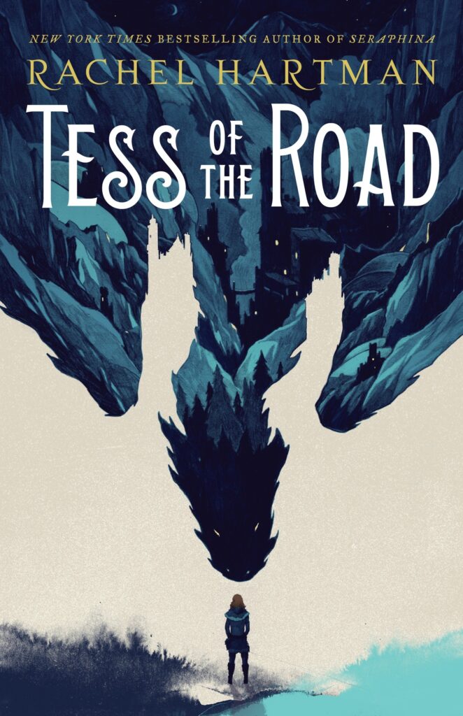
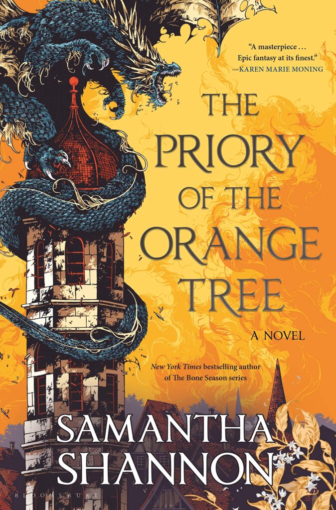
Take a look at these two covers. One is Tess of the Road, while the other is Priory of the Orange Tree. Both feature dragons, but in a completely different way. We’ve got Tess of the Road with a more “simple” design, drawing the reader’s eye to the small human character at the bottom. And we’ve got Priory of the Orange Tree, with its bold, striking covers. I love both these books, and they both went for an entirely different feel with their covers to draw people to them.
Personal Preference
Last but not least, is personal preference. As I stated above, I love my covers. Even if they can be construed as more horror like (I mean, granted, book 2 does get pretty brutal), I think they represent each book fairly well, and I love how they look. If I didn’t, I wouldn’t take nearly as many photos of them as I do.
It’s important for you to feel good about your cover. No matter what anyone else says, no matter what people think, if you like your cover, that’s important.
And that’s it! A few things I consider when I’m designing my covers. Of course, my designs would be nothing without my incredible artist, Gabrielle Ragusi. An amazing person and a delight to work with, as always. Please go support Gabrielle on Instagram, Twitter, and Facebook!
Have a great day everyone, and stay safe out there <3